Showing posts with label Kayte Designs. Show all posts

Tuesday, October 2, 2012

BRAND SPANKING NEW KAYTE DESIGNS SITE!

I am so excited to be launching my new Kayte Designs website today! I have been working with graphic designer and web developer Jeff Corey for a few months now on rebranding Kayte Designs and and improving both my business site and my blog. The blog will be ready to launch in a couple weeks and I will be changing the domain to crazygooddesigns.com, but first comes the new and improved kaytedesigns.com. The new KD logo was created with a pattern that I always doodle while I'm brainstorming. I like the mix of a hand drawn pattern and a fat, bold typeface. I've worked with Jeff Corey on a few of my commercial projects, he created the logo and branding for 5th Street Cafe, Escorpion and he did the wall graphics for Scenario. I knew that if I gave him a bunch of links to sites I like he would be able to help me pin-point the exact look I need for my web site. It's similar to what I can do if a client who shows me pages from books and magazines- I can analyze what the images have in common and what the basic theme is through out. Jeff and I worked on creating a simple gallery style site that is an elegant background for my photographs. I think the site is easy to navigate and rich with content. Below are some images of the key features and changes.


Not only did Jeff help me get my site visually pleasing, we also added some much needed features like ways to connect via social media and live feeds from Twitter, Instagram and and Pinterest accounts.


The new site operates through Wordpress, I am so happy with how easy it is to add to my portfolio and the News feed. I created the old Kayte Designs site through iWeb and I felt like it was always giving me problems. I set up the Portfolio section to work like a blog so I could add work to it often but it was such a nightmare to operate that I eventually stopped adding to it. The back end of this Wordpress site is so simple and it looks 100 times better! Make sure you check out my new site at Kaytedesigns.com and check back soon for the new Crazy Good Designs site.


Monday, October 1, 2012

OCTOBER OBSESSIONS

October is a extra special month for me, it's my favorite. I love the weather, football and Halloween. It's my husband's favorite time of year too, that's why we got married on October 4th three years ago. I look forward to celebrating our anniversary this month and I am also looking forward to launching my two new sites for Kayte Designs and Crazy Good Designs (more on that coming soon). I'm starting this fantastic month off with a few things that I am totally obsessed with right now. As I've mentioned a few time, we can look forward to a lot of deep, royal colors this fall. I love this navy blue nail polish in a matte finish by OPI. I also encourage you to check out the Drawing Study bench on Anthropologie's site; there's a variety of one-of-a-kind benches designed by Leslie Oschmann.  The legs are repurposed from antique stools and the wood bench top is beautifully collaged with original sketches and remnants of Oschmann's old works. Obsessed!

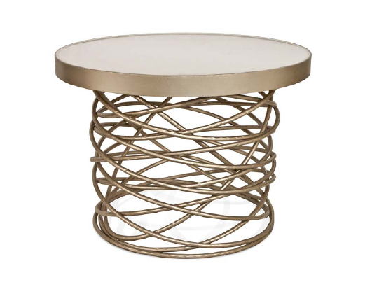
A. Swing Table by Duffy London
B. No Fair Bookends from ModCloth
C. OPI Nail Polish in Russian Navy
D. Drawing Study Bench from Anthropologie
E. Leather Feather Necklace in Red from FAB
F. My new Kayte Designs logo and website!


Friday, July 27, 2012

100 AND COUNTING!!

I am so excited to announce that this is my 100th post! I started this blog with no real direction or goals, mostly I thought it would be an easier way to share some of my portfolio and to keep track of design related things that I love. 

Looking towards the future, I have some goals for my blog and some projects I'm working on. I recently started working with my favorite graphic designer, Jeff Corey, on upgrading my blog, as well as my business site for Kayte Designs. This project will include rebranding, a new Kayte Designs logo and two new websites! With my new blog comes new goals for me. Considering the fact that a large part of my interior design work is in the restaurant and night club category, I plan on including more post on the subject. I am very passionate about hospitality design; I worked behind a bar for many years and my husband is in the industry. Looking back on my old posts, I'm really surprised I haven't touched on the subject more. Another focus for me is organization. Up to this point my posts have come to me very organically, which isn't necessarily a bad thing, but I'd like to lay down some structure and start organizing my blogging month a little better. Even though 100 posts feels like a whole lot for me, this blog is definitely still growing into it's shoes and I am still trying to figure out what direction to take things. I appreciate your support, keep on reading! I'm very open to suggestions as well- do you have a favorite post? anything you want to hear more about? Any feedback you may have is more than welcomed.


1. Here's a little teaser of something my graphic designer and I are working with, curious? 

2. Coming soon, post about well designed bars and restaurants from across the globe, as well as local hotspots and recents projects I've worked on in the hospitality industry. 

3. Time for a little structure! I have a wall in my office that I've been meaning to paint with whiteboard paint- what better time then now. I'm going to set up a big ol' calendar set up to help me organize this blog as I step into the triple digits.


Thursday, April 12, 2012

URBAN HERBS

Last weekend I finished up a little home project inspired by a photo I found on Pinterest via a post from Apartment Therapy. I have a coffee table on my patio that has seen better days; the wood slat top is rotting but the metal base is in great condition. The image inspired me to transform my table into an rustic herb garden. For my pallet garden to fit on the table I had to cut down one end, this gave me an extra board that I used to create a small drink ledge so the planter would also function as a side table. 


Below is a real simple step-by-step to help you create your own "urban garden" with a pallet. Pallets are really easy to find; ask your local hardware store or grocery store if you can take some or keep an eye out for them by commercial dumpsters (no shame in dumpster diving people). The lumber is great for small crafty projects because in most cases it's already distressed and the components are small enough for most people to manage. 
When you get ahold of a pallet make sure you remove any splinters and loose nails and sand down the edges. I wrapped the back and exposed sides of the planter with weed barrier fabric and then stapled it in place starting from the middle and working my way out. When you are trying to figure out where to place your fabulous new garden, make sure you consider drainage. My existing table was a great option because the top was loosely slated wood and would allow for rain water drain out, in my inspiration photo on Pinterest they rested their planted against the wall. When your planter is sealed tight fill it with potting soil plant your desired herbs or flowers. It took me close to 2 bags of soil to fill the pallet and I based the amount of herbs I planted on the distance required by each plant. When the pallet was full and planted I hosed it off and added my final board that would make up my drink ledge!


Wednesday, February 1, 2012

I SPY SOMETHING ORANGE

I just finished a custom painting for one of my clients and I thought I would share. This is the second piece I've done in this style, the first one you can see here. I used 4"x4" Cradled Artist Panels in three different profile heights, acrylic paint and a model wood backing. My client wanted orange to be the prominent color and she wanted the painting to tie the room together. I incorporated some inspiration I found in the space; the rug pattern, an inlay on her table, pillow and wood floor colors. Both clients had orange and red as an accent color in their homes, I think I'm going to make another one (for myself) with more cool colors like blue, black and silver. I really liked adding the personal details to this one, next time I would like to take it even farther by adding some photos and quotes. Hope you like it!


Wednesday, January 25, 2012

THE LIGHTING SWITCH-UP

Last week I took a photo from Elle Decor and showed you how switching up one furniture piece would change the whole mood of the room. When I look at a photo of a room I can imaging the particular person or family it was designed for, by switching a focal piece it's like you are switching out the inhabitant of the photograph. The person becomes a little more refined and traditional or they have a wilder sense of humor or a taste for modern art. Each piece of furniture in a photo tells a part of a story, by shaking things up slightly you may alter the ending.
Today's beautiful dining room photograph is from Pintrest.com. Lighting is such a important part of design and the options are endless! Below are a few chandeliers that would impact this dining room greatly if switched.

pinterest.com


I really like the staircase in the background of this photo and I thought by adding some warm bronze to the for-ground it would make the carpet on the staircase pop. The fixture I picked is a crystal globe from Restoration Hardware. I was hunting for something in this color palette and this one was a clear winner because the globe shape plays off of the arched doorway, the drapery pattern and the chair back pulls. Because of the form and finish, it would add formality, antiquity and tradition to the room.


This funky fixture is called Knotty Bubbles and it could take on a lot of different rolls depending on it's environment. This dining room is transitional and the current fixture reminds me of British Colonial Palms (a popular style in the South). If we switched it with the Knotty Bubbles it would steer away from "Southern Plantation" and straight towards "New England Shoreline".  This nautical inspired fixture would look beautiful against the grey and sea-foam color scheme and would add a slight touch of rustic charm. 
The Josephine Queen Chandelier by Metalarte has become a pretty iconic fixture (that few can afford). It's a really sexy and modern take on a traditional form. The shades also come in acrylic but I like that the linen option brings it back down to Earth a little. The curved lines and traditional form suite the room well, while the material and color transform the room into something young and daring.

metalarte


This fixture is my personal favorite of the bunch! I love mixing traditional and contemporary pieces and this chandelier from Y Lighting is a big jolt of excitement in a very mellow setting. The dark bronze finish would accentuate the dark details in the room, like the rot iron railing and the dark chair legs. Because it is a skinny fixture, it wont add too much weight to the setting.


Wednesday, January 18, 2012

GAME TIME BRO!

My personal design style typically leans towards the masculine side. I like dark and cool color palettes, modern design, slick and sexy furniture, and natural materials like exotic woods and uncommon stone. The day a client comes to me for an outrageous Bachelor Pad or  Man Cave, I will be thrilled and very prepared! I want to share some really cool game tables I've been sitting on, they'd make a perfect statement piece for a Man Cave.

This beer pong table was recently featured on Fab.com and I would love to use it somewhere - maybe that  dream bachelor client or a sports bar design in my future?? The table is sophisticated and well executed, hard to believe the goal of this table is to get you sloppy drunk!


chippewa five beer pong table

Tuesday, January 17, 2012

THE SWITCH-UP


I want to show you guys how easy it is to change the mood of a room by switching one or two key items. The photo below is from Elle Decor's Favorite Rooms of 2011. The room is very clean, simple, modern and understated. The furniture gives the space a masculine feel, but by adding the Love artwork it becomes more feminine. The chairs are iconic Mid-centruy and the concrete table and accessories gives the room some natural elements. Watch what happens when we switch up the pedestal table with some other styles.

Elle Decor


This iconic table by Eero Saarinen is a safe switch-up because it's from the same era as the chairs. By replace the existing table with this one, we would be giving the room a very definitive Mid-century style. The color palette in the photograph is monochromatic white with black as an accent, the Saarinen Table would push it into a black and white high contrast scheme. 

saarinen table


I picked this table based on the artwork in the image, it feels like a Pop piece and it also makes me think of Palm Springs. The Bianca table by Bradley Hughes would add more of that glitz and glamour into the room.

bradley hughes


This table comes from B & B Italia, a leader in high end modern furniture design. I picked it because it's a very traditional form and it would add a level of polish and tradition to the room. Because the table is lacking decorative details, it remains fairly modern.

b & b italia


The Drain Table by Marcel Wanders is a humorous table that would add a spark of youth and cheer into the room. The bright color adds some warms and a burst of life and the glossy red plays off of the Love artwork. It's made out of aluminum sheet and there's a glass panels covering the hole in the center. When you see this table in person it has the illusion of a deep sinking hole in the center.

cappellini


A very different approach to adding warmth into the photo is with this table made out of natural drift wood. The warm wood brings some of the nature in the background, into the for-ground. The glass top keeps the space airy and light.

pieces atlanta
Consider this game if you have a room in your house that's feeling a little stale. It's fun mixing different styles and eras together to create unique moods. Don't be afraid to try something new!


Wednesday, January 11, 2012

THE VIEW FROM ABOVE

If you haven't discovered Fab.com, today is your lucky day! There are loads of daily deal sites for home goods and fashion; RuLaLa, The Foundry, One King Lane, Jack Threads and so on. In my opinion, Fab.com kicks the competition's toosh! One of the sales going on now is for high quality prints from photographers Brent and Sara of Denver based studio, Patterns from Above. They photograph landscapes from a plane to create really interesting abstract images. I love maps and globes, so this style of aerial photography really gets me! Check out Brent and Sara's work, 18" x 18" prints are for sale now for $70.00 on Fab.com.


Here is some similar aerial photography from artist Matthew Moore. You can find this artist on another badass website 20x200. This site is a really cool online store that features limited and affordable prints from a handful of artists. It's a great middle ground between buying mass produced art (lame) and original art (expensive). The site is broken down by Price, Category, Color or Artist and each artist has a brief bio and link to their personal site so you can get into the idea of collecting art. 


matthew moore


While we are on the subject- I've been dying for the chance to use one of these really unique rugs I first found in Dwell Magazine. Landcarpet is an Australian wool rug collection designed by Florian Pucher. The thick and three-dimentional texture is so well made and the color palettes would suite a lot of different rooms and finishes. 


europe

africa

italy


usa


Wednesday, December 28, 2011

BACK TO THE GRINDSTONE

I just got home from a busy trip to Connecticut and I have an endless stack of "to-dos" along with a house full of suitcases and boxes. My house is a disaster zone, including my home office and it reminded me of when I first moved in. We looked at around 30 rental properties before we found the house we are in now and the biggest thing on my list was office/studio space. Before we found our house in Underwood Hills, we were close to signing a lease on a small house with a big yard in Cabbagetown. No office space inside meant I needed to get creative outside. Should I rent a studio space down the road or build one on site? Turns out, after a bit of research if found all kinds of amazing options for backyard shed/studios. Today is the kind of day I wish I could hid out in a backyard office and cram out some work without life distracting me! Check out some of the cool studio spaces I discovered a couple years back and some new upgraded offices I just found (while searching for the motivation to get back to reality).


If you have a minute, check out the full article on this Busy Box Studio on Design Sponge. This shed turned studio gave me my first burst of inspiration! I was on eBay and Craigslist daily, trying to find a used shipping container or trailer that I could transform into a workspace. 
via design sponge


bolb vb3


Here are a few pre-fab structures by a company called kitHAUS. They come in a variety of sizes and they can be used for an office, art studio, sitting room, cabana, ect. Below the pictures of kitHAUS is an English company that builds eco-friendly garden rooms; they would make a beautiful and professional office but sadly I don't think they can transport the factory build structures from Sussex to Atlanta.


eden garden rooms


airstream via mocoloco.com


I just found this funky pod on If It's Hip, It's Here. Tetra Shed is from the UK and will be available to us in America January 2012.


via if it's hip, it's here


Here are a few more creative spaces from Pintrest. 

pintrest
pintrest

pintrest


I hope you all are adjusting well to work after this Christmas, here's to New Years!

About Me

My photo
As a lover of all things creative, I've created this blog to inspire and admire crazy good design. I own Kayte Designs, a small interior design firm with a focus in Hospitality, Residential and Office Design. We are based out of Atlanta, GA.

Followers